Sustainable by Design: A Q&A with Todd Barsanti
Could graphic designers save the world? Maybe if more were like this member of Al Gore’s Climate Reality Leadership Corps.
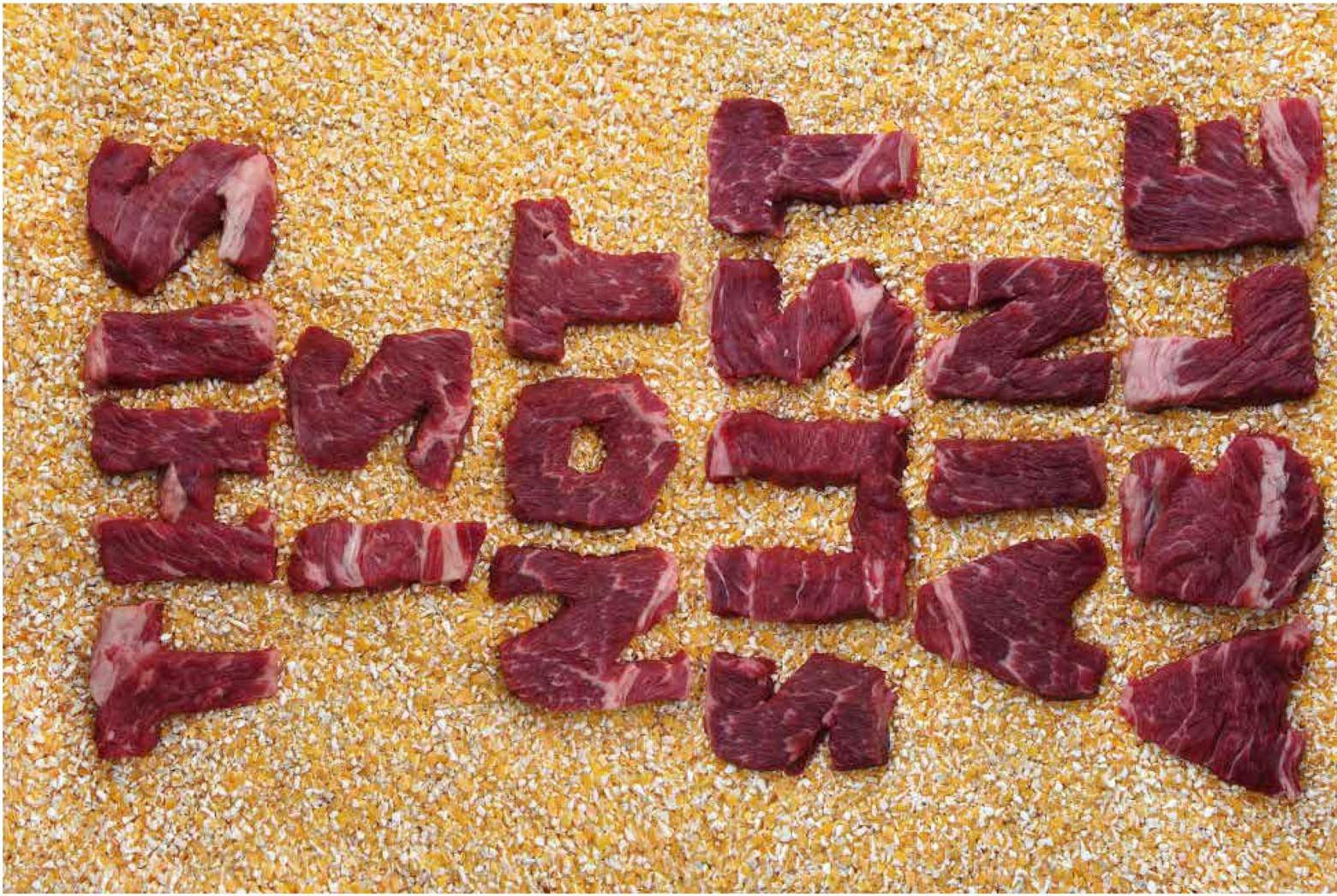
Pieces of beef spell out “This is Not Sustainable” against a backdrop of animal feed made of corn, in graphic designer Todd Barsanti’s set-up for one of three environment-themed posters.
Todd Barsanti isn’t your stereotypical eco-warrior — he teaches graphic design at an Ontario community college. But he is also one of nearly 14,000 individuals trained to give Al Gore’s climate change presentation (the one featured in the Oscar-winning 2007 documentary, An Inconvenient Truth). A latecomer to the environmental movement, Barsanti constantly seeks links between his distant-seeming passions for design and sustainability. The most striking example of this connection-making is a series of posters he created in 2016, using attention-grabbing materials — charcoal, Christmas lights, raw meat — to convey environmental messages. He recently spoke with Asparagus about his eco-awakening, where design meets sustainability, and a late-in-life lesson about the tide. (This interview has been edited for length and clarity.)
On his late-blooming environmentalism
Todd Barsanti: I didn’t start out as an environmentalist. A lot of people in the movement have this awakening moment in their childhood, or as they were growing up, and that never really happened for me.
I was a professional graphic designer for about 16 years. And while I was doing that I started teaching design part-time. I knew that if I wanted to transition into full-time academia, I needed to get a master’s degree. My initial thought was that a master’s in design was the obvious direction. But a mentor of mine at Sheridan College suggested I look into environmental studies. And I thought that was odd. But he said there were a couple faculty in the arts at Sheridan [with environmental studies degrees]. He really liked the way they thought, and their problem-solving abilities. He thought I’d be a good fit. And it was, it was just a great fit. The Faculty of Environmental Studies at York University, they welcomed me.

Once I started doing my master’s, I learned about sustainability. A lot of people just associate sustainability with “green.” But I learned that for a solution to be sustainable, you have to look at it from social, economic, and environmental perspectives. As a designer, we always look at the big picture when we’re trying to solve problems. So this concept of sustainability had a lot of ties for me with what I already knew. That’s when I realized there was a place for me in all of this.
A mentor of mine suggested I look into environmental studies. And I thought that was odd.
On giving Al Gore’s climate change presentation
In 2013, I was invited to a training session in Chicago with the Climate Reality Project, which is Al Gore’s not-for-profit organization. I was trained on giving his presentation, and now I volunteer my time and give talks on climate change. I always try to get in with teens, high-school age, and college age.
The presentation itself is very much based on the documentary, An Inconvenient Truth. But it’s constantly changing. The science of why the earth is warming and how that’s happened hasn’t changed, but how it’s affecting us is a moving target.
What’s really beautiful about it is — because we all have diverse backgrounds — they encourage everybody to customize the presentation to our own needs. So I focus on things that I know, that I can get people energized about. And I’ve been able to write the presentation into curriculum. So I give my presentation to 500 [design students] every year. I get to help them understand how their role as a visual communicator can help the cause.
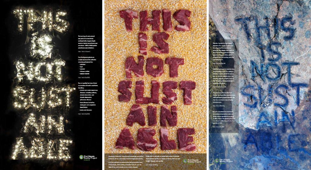
Barsanti created the This Is Not Sustainable poster series during a weeklong design residency with DesignInquiry, in Vinalhaven, ME. The posters use non-traditional materials to engage viewers with sustainability concerns around coal-fired power plants, industrial farming practices, and the oil and gas industry.
On the origin of his This is Not Sustainable poster series
When I was doing my master’s, I struggled to figure out, “How do I, as a graphic designer, fit into this thing?” I came to realize it’s about the design process and problem-solving. Six years ago I was hired as full-time faculty in the Art Fundamentals program at Sheridan College. I started experimenting with this idea of getting students to work with non-traditional materials. Looking at the communications that they’re trying to put out there, and see if they can use materials that help to get the messages across.
The first project I did with them was one where you communicate the meaning of a word typographically. So, it couldn’t be a noun, it couldn’t be something as easy as putting the letters D-O-G in the shape of a dog. I said, “It has to be a verb or a descriptive.” One student would do “spill” and actually spill milk on the table and put it in the shape of the word “spill.” Or “broken,” and break some glass and arrange it on the ground.
I thought, “Here’s an opportunity to bring the two worlds together of design and environmentalism.”
Even though I’d been designing for so many years, I didn’t have a lot of experience doing this. An opportunity came up to go on a one-week residency in Maine. I decided I wanted to create something using non-traditional materials so I could use it as an example in class. And then I thought, “Here’s an opportunity to start putting out some messaging that can bring the two worlds together, of design and environmentalism.”
Then it was a matter of seeing if there was a way the materials might be able to engage the audience a little bit better. If they’re just black words on a white background, everyone will read it and then move on.
So I went away for the week. It was on an island off the coast of Maine on a farm, and we were completely secluded. There wasn’t even any internet access. So I brought my rubber boots, and lots of clothes I could get dirty in, and mucked around in the mud for a bunch of days.
On the design process for the posters, from choosing subjects through creation
I think it’s actually a work in progress, there’s more in the series that I could create. From a problem-solving perspective, [the topics] had a lot to do with the materials I had access to and how that might shape the messaging. But also, [I chose] messaging that I felt was most important to get out there.
Coal-fired power plants are something we continue to struggle with because it’s such a cheap way of creating electricity, but it’s so dirty. In Ontario, the government closed the last coal-fired power plant in 2014. In 2012, Toronto had 16 smog-alert days. And since closing that plant, we’ve had almost none. It’s mind-boggling what an impact it made. And yet you hear about coal-fired power plants around the world where they’re trying to ramp up production, like in the United States.
With the lightbulbs, I thought, “I’m not an electrician, but what can I do?” The first idea was regular household lightbulbs, but I didn’t have the wherewithal to wire that properly. So I ended up using Christmas lights.
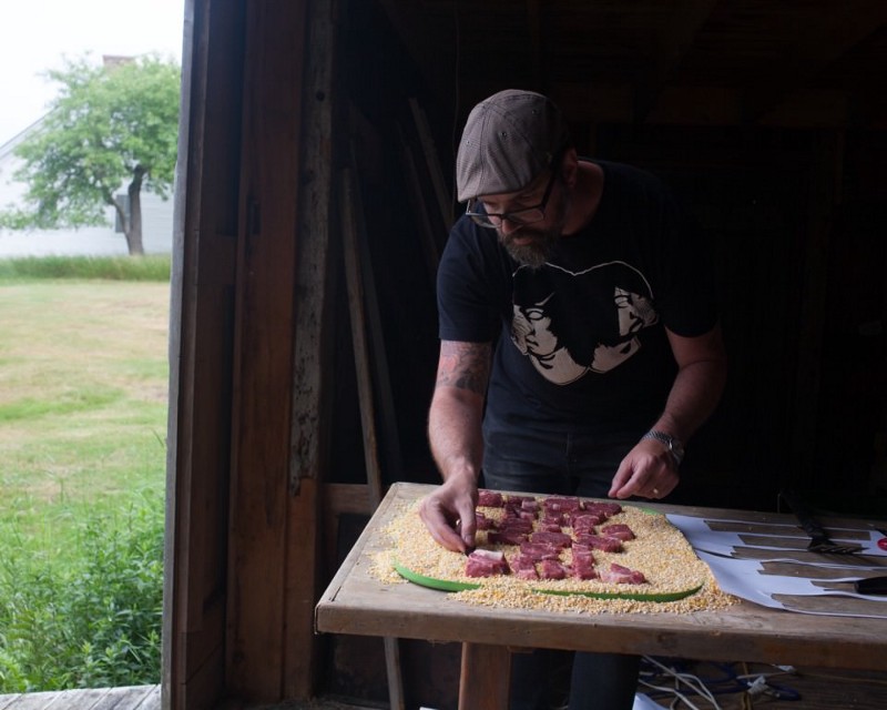
Barsanti arranges letters cut from raw beef on a bed of corn feed.
The meat-production one was probably the easiest to put together, and probably the one that gets the most attention. But it was really the third idea. My next idea was the oil one. I had ideas about how to do oil on the beach. But in the middle of the week it rained for a couple of days, so I couldn’t get out and do that properly. I ended up going to the supermarket, just walking around and seeing what they had. The letters are cut out of beef roast and sitting on a bed of corn feed — the most popular feed they use in industrial farming practices. [The beef was subsequently cooked into a stew.]
The last one took a few days to figure out. I didn’t want to literally put oil on the beach, that would defeat what I was trying to do. And when I got to Maine, I realized there weren’t any beaches. It was on the ocean, but it was all rock. My original concept was to do it in the sand, and I did all kinds of research into what oil spills look like on sand. And I got there, and there was no sand.
As an Ontarian who grew up on freshwater lakes, I didn’t know anything about tides. It just blew me away how much the water came in and went out every day. I was sitting on the deck with one of my colleagues, and I said, “So, the water, how often does it go out and come in?” And he looked at me like “Is that a serious question, or are you being silly?”
I didn’t want to literally put oil on the beach, that would defeat what I was trying to do.
When the tide was out, I would go out and explore, and I figured out there were rocks that would be completely submerged when the tide came in. So [I could take pictures of] the water rising, but it would also clean the surface after I stained it. I came up with a concoction of water-based India ink, flour, and water, to make it look like oil. And tried a whole bunch of different techniques: pouring it, splashing it, or doing stencils. I found the easiest was just to paint it right onto the rocks. And then I sat there for three hours and waited for the tide to come in, and took hundreds of pictures as the tide slowly came in and engulfed that rock.
The funny thing was that I completely cut off my way back once the tide was in, so I had to take all my materials, climb up a ridge, and hike about a kilometre to get back to the farm.
What he learned from the project (beyond how tides work)
What I learned, and what my students learn when they’re working with non-traditional materials, is that you can’t predict the outcomes. You might have a vision in your head, but until you start getting your hands dirty and working with things, there’s no way of predicting the way the materials are going to react. For a foundations level design course, I find it’s key because it gets the students comfortable with that unpredictability. And to tie it back to sustainability, I think that really helps them, moving forward, when it comes to tackling really difficult problems.
On how graphic designers can help build a more sustainable society
What we do well is communicate through visuals. So I think the obvious answer is through the messaging we choose to put out there, and the types of jobs that we choose to take on. But what I’m trying to instill in my students is that — beyond the messaging, beyond the final product — the process they take to get there is equally important. I don’t have any ego to believe that graphic designers are the only people that are going to solve all the world’s problems. But I do think designers have a way of approaching problem-solving activities that would help a lot of people.
Beyond the art we’re creating, the skills we have as artists are things we can use to help other people.
If you’ve got someone who is trained in communications but also has the imagination to look beyond the immediate needs of any problem, I think that’s where we start to get into solutions that have potential to grow. A lot of what I talked about when I did my master’s was this idea that, “No, designers aren’t going to save the world, but we can be sitting at the table. We can be part of that discussion.”
When I go into the classroom with 17-, 18-, 19-year-olds, that empowers them. That makes them see that there’s a place for them. Helping them to understand their role as an artistic person who has imagination and can tap into that imagination. Beyond the art we’re creating, the skills we have as artists are things we can use to help other people.